Engulfing patterns come in both bullish and bearish configurations:
(Click to enlarge)
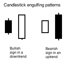
A bullish engulfing pattern frequently portends a change from lower prices to higher prices. It is comprised of a large white body that engulfs a small dark body in a downtrend. This candle shows buyers entering at a lower price than the day before, but ending at a higher price than the previous day’s high.
A bearish engulfing pattern frequently portends a change from higher prices to lower prices. It is comprised of a large dark body that engulfs a small white body in a downtrend.
This candle shows sellers entering at a higher price than the day before, but ending at a lower price than the previous day’s low.
It is important to note that it is the body part of each pattern that is engulfed. It is common to have the wicks outside the engulfing candle’s range.
Let’s take a look at some charts illustrating these engulfing patterns.
Chart courtesy of StockCharts.com
(Click to enlarge)
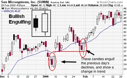
Chart courtesy of StockCharts.com
(Click to enlarge)
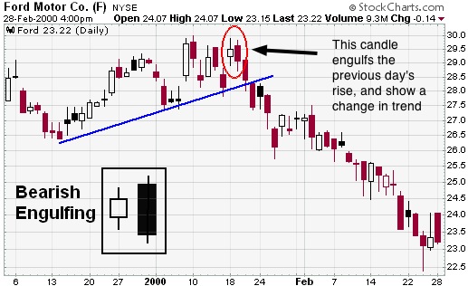
Notice at the end of the Ford chart above there is a hammer on Feb 25th. This could be marking the end of the price decline.
[gpp_divider type=”dashed” color=”green”][gpp_divider type=”dashed” color=”green”]
You’ve now learned the basics of candlestick chart reading. The next module will teach you the most powerful chart patterns that you will use to buy and sell stocks.
Practice putting in different stock tickers at StockCharts.com and look for the different formations you learned about. The home page of stockcharts.com includes a grid of popular stocks and funds that you can use for this exercise. Look for:
Be sure to check both daily and weekly charts.
Did the appearance of these patterns result in a change in the stock’s trend?
[gpp_divider type=”dashed” color=”green”]