A moving average is an important indicator found on stock charts. It shows the average of the price of a stock over a number of days that you select.
It is a trend-following indicator, but as it is made up of previous price information, it is a following indicator, not a leading indicator.
Most charting programs like StockCharts.com or Yahoo Finance allow you to put in different parameters for technical studies, including moving averages. Let’s look at a daily stock chart of FleetCor Technologies (FLT).
Chart courtesy of StockCharts.com
(Click to enlarge)
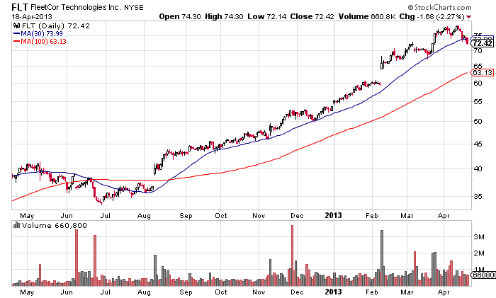
The blue line is the moving average for the last 30 days, and the red line is the moving average for the 100 days. These are commonly notated as 30DMA (30-day moving average) or MA(30) and the 100DMA (100-day moving average) or MA(100).
The longer a stock remains above its moving averages, the more powerful the trend upward. FLT is in a powerful uptrend; it has not even had a pullback to the red 100 day moving average.
Notice that once FLT broke out in August that it would come back and touch the 30-day moving average every so often, then continue higher. This 30-day moving average provided support for the price on small dips. It also provides areas to purchase the stock if you missed the initial breakout back in August.
Think of it like you are on a train platform waiting for the train. You are waiting at the 30-day moving average train station for the train, and the train stops and picks you up on its way to its northbound upwards destination.
Moving averages also act as points of resistance on a chart. These translate to price points where stocks tend to stall out on a rise.
The following Celgene chart below shows where the moving averages acted as both support and resistance to its price moves. The price bounces off the moving average as support, and gets turned back at a moving average as resistance.
Chart courtesy of StockCharts.com
(Click to enlarge)

It is not uncommon for prices to overshoot the moving averages a bit. In the example above, many times the price came right to the moving average but a few times it overshot, as you can see in June 2012.
The 30 DMA, 50 DMA, and 100 DMA are all common spots to provide support or resistance, but I have found that the days can vary. In recent years, the 25-day moving average seems to work better for many stocks than the 30 day. You have to put in different time frames into a chart to see which one catches the dips and valleys the best.
Placing an order to buy at one of these moving averages is a technique sophisticated investors use all the time. In the above Celgene chart, there were some great spots to put a buy order at – in early November 2012 at the red 100 DMA, and in March 2013 at the 30 DMA.
Although not shown on any of our charts, the 200 DMA is a place where the big institutional players like to support and purchase stocks.