In most of the charts we’ve seen, you may have noticed that the shorter-term moving averages have been above the longer–term ones when a stock is rising. Conversely, you may have noticed that the moving averages were reversed when a stock was declining.
The points when two moving averages cross one another are considered important price points. Let’s look at two of these important crossings – the golden cross and the death cross.
The golden cross is a bullish indicator when the 50 DMA crosses above the 200 DMA on a chart. This indicates that both the shorter- and longer-term trends have turned up, and signals prices should continue up.
Below is a chart of Apple, going back to 2008. Notice the golden cross around June of 2009.
Chart courtesy of StockCharts.com
(Click to enlarge)

The death cross is a bearish indicator where the 50 DMA crosses below the 200 DMA on a chart. This indicates that both the shorter- and longer-term trends have turned down, and prices likely will continue down. Let’s continue with the Apple chart as it began to fall in price in September 2012.
Chart courtesy of StockCharts.com
(Click to enlarge)

For long-term investors, buying a stock at a golden cross and selling at a death cross can get you in near the bottom of a major move, and sell near the top before a major decline. Let’s look at Apple’s long-term chart to see how this would have worked.
Chart courtesy of Yahoo Finance
(Click to enlarge)
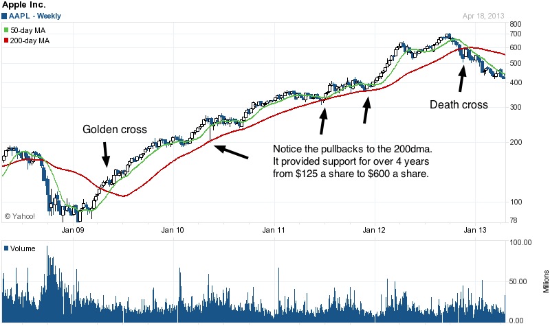
Buying the stock when it had a golden cross in 2009 and selling it in 2013 when the death cross appeared would have enabled you to catch the majority of the stock’s move up, about $475 a share!
Always keep in mind that the appearance of either the golden cross or a death cross does not mean prices will necessarily go up or down. It just gives you a strong possibility that the trend will continue going in the direction the cross indicates.
All indicators are best used as guidelines, not as a crystal ball that always has the right answers.