The volume indicator found at the bottom of a chart is important. Volume shows the actual number of shares traded in any given period, and shows the current supply and demand for that stock.
In the charts from StockCharts.com the volume appears below the chart. Grey volume means volume on an up day in price; red bars denote volume on a day the stock declined in price.
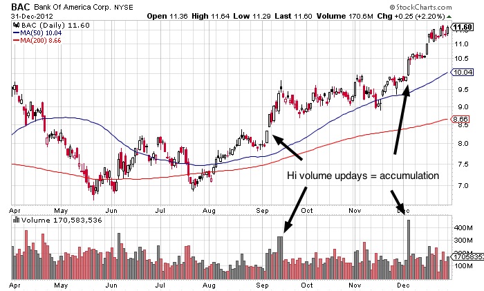
Big volume on up days is called accumulation. It indicates that the large institutions and mutual funds are buying, and that is very important as their buying power drives a stock higher over the long term.
Chart courtesy of StockCharts.com
(Click to enlarge)
Note: A rising stock price with less and less volume can mean the stock is running out of institutional support, and could lead to a top and lower prices.
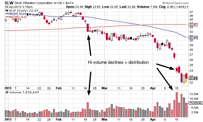
Distribution is when a stock closes down on higher volume than a previous up day. Too many distribution days in a row can indicate that the big funds are selling the stock, and it can be a sign of potential trouble.
Chart courtesy of StockCharts.com
(Click to enlarge)
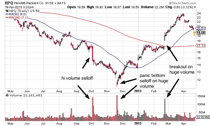
Heavy volume at the bottom of a sell-off can point to the sell-off potentially coming to an end. Panic selling after weeks or months of declining prices often ends this way.
In the following Hewlett-Packard chart, panic selling was followed by high-volume accumulation on a breakout.
Chart courtesy of StockCharts.com
(Click to enlarge)
You want to see higher volume on rising stock prices, at least at the beginning of a major move.
Another key to stock market investing is looking at whether the major stock market indexes are under accumulation or distribution. In general, if the whole market (The Dow, S&P 500, and NASDAQ) shows more than 5 distribution days in a short period of 1-3 weeks, the market trend is likely turning bearish and it is best to take profits, lighten up on positions, or move to the sidelines.
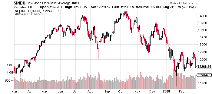
To illustrate this, I am going to use a chart of the Dow making its top in 2007 before the financial crisis plunge of more than 50%. The first chart is a big picture of the Dow from March 2007 to March 2008.
Chart courtesy of StockCharts.com
(Click to enlarge)
This next chart zooms in a bit, only showing the Dow from September 2007 to December 2007. This many red candle days on higher volume shows distribution. This led to a large sell-off that ended in March 2009.
Chart courtesy of StockCharts.com
(Click to enlarge)

When the current market leaders start to show signs of selling or distribution, especially on high volume, that is generally a sign that the rally is fading and the trend may be turning from bullish to bearish. Check out the charts of market leaders to confirm this.
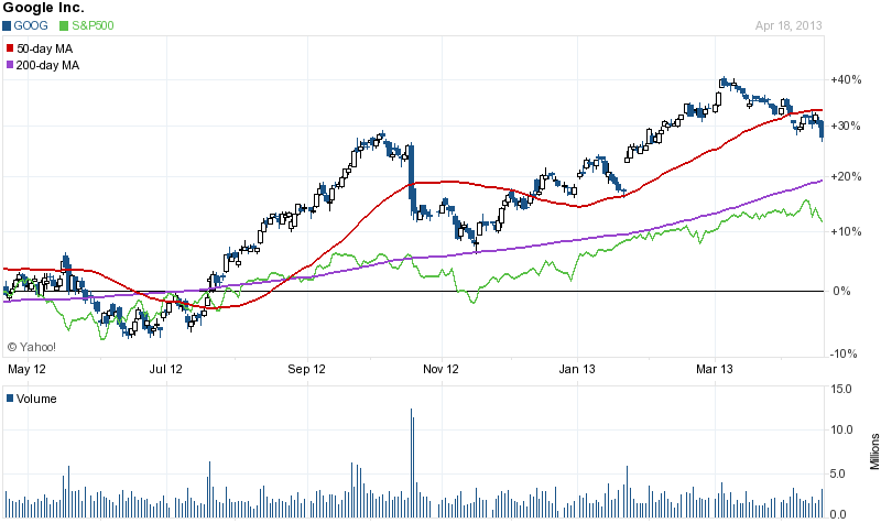
The following chart shows market leader Google (in blue) charted against the S&P 500 index (in green). Both are following the same basic chart pattern.
Note that Google is showing a decline starting in March 2013 while the S&P 500 continues higher; this is a subtle sign of non-confirmation of the bullish trend.
Chart courtesy of Yahoo Finance
(Click to enlarge)
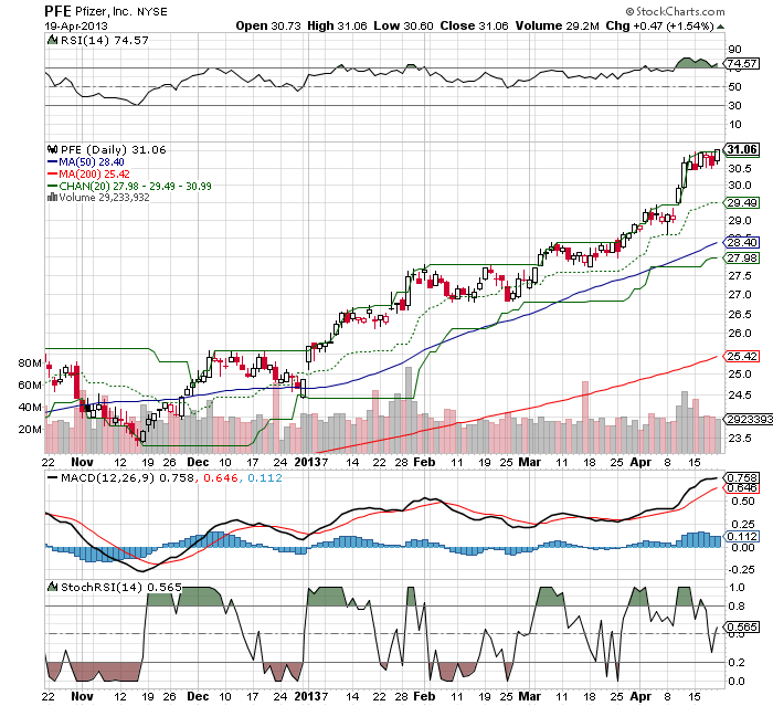
There are literally dozens of indicators you can use in putting together charts. But after experimentation with all of them over the last 20 years, my advice is to keep it simple. All you really need are candlesticks, volume, and moving averages.
In fact, the less information in a chart you have to analyze, the better and clearer the message. Sounds backwards, but it’s true.
Too much information leads to analysis paralysis. Look at the chart below where I have added indicators such as MACD, RSI, stochastics, and price channels. It’s confusing, and these additional indicators cloud the view of what is most important – the actual price movements.
Chart courtesy of StockCharts.com
(Click to enlarge)